A Case Study
UX, UI, and branding are not separate entities, rather they are all vital organs necessary for a product to function. They should evolve in parallel, following a singular rationale.
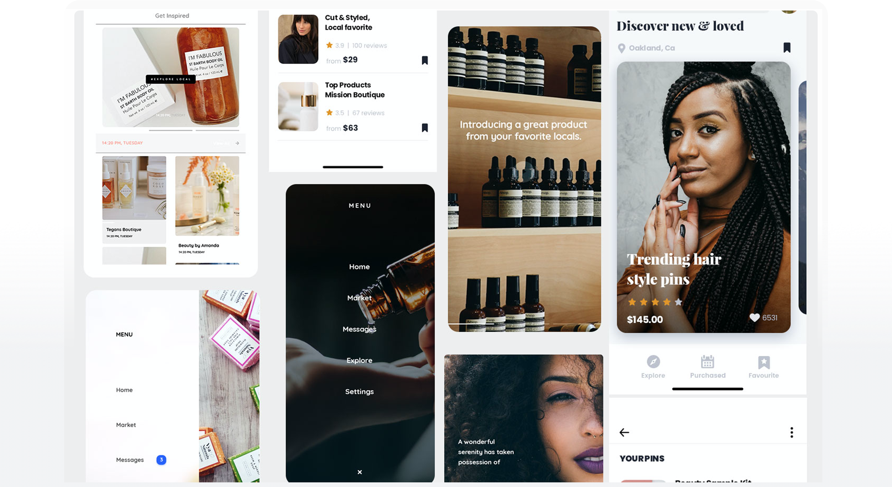
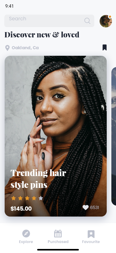
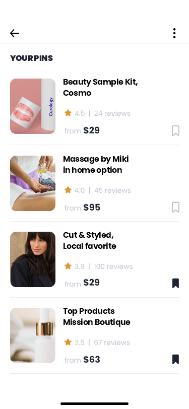
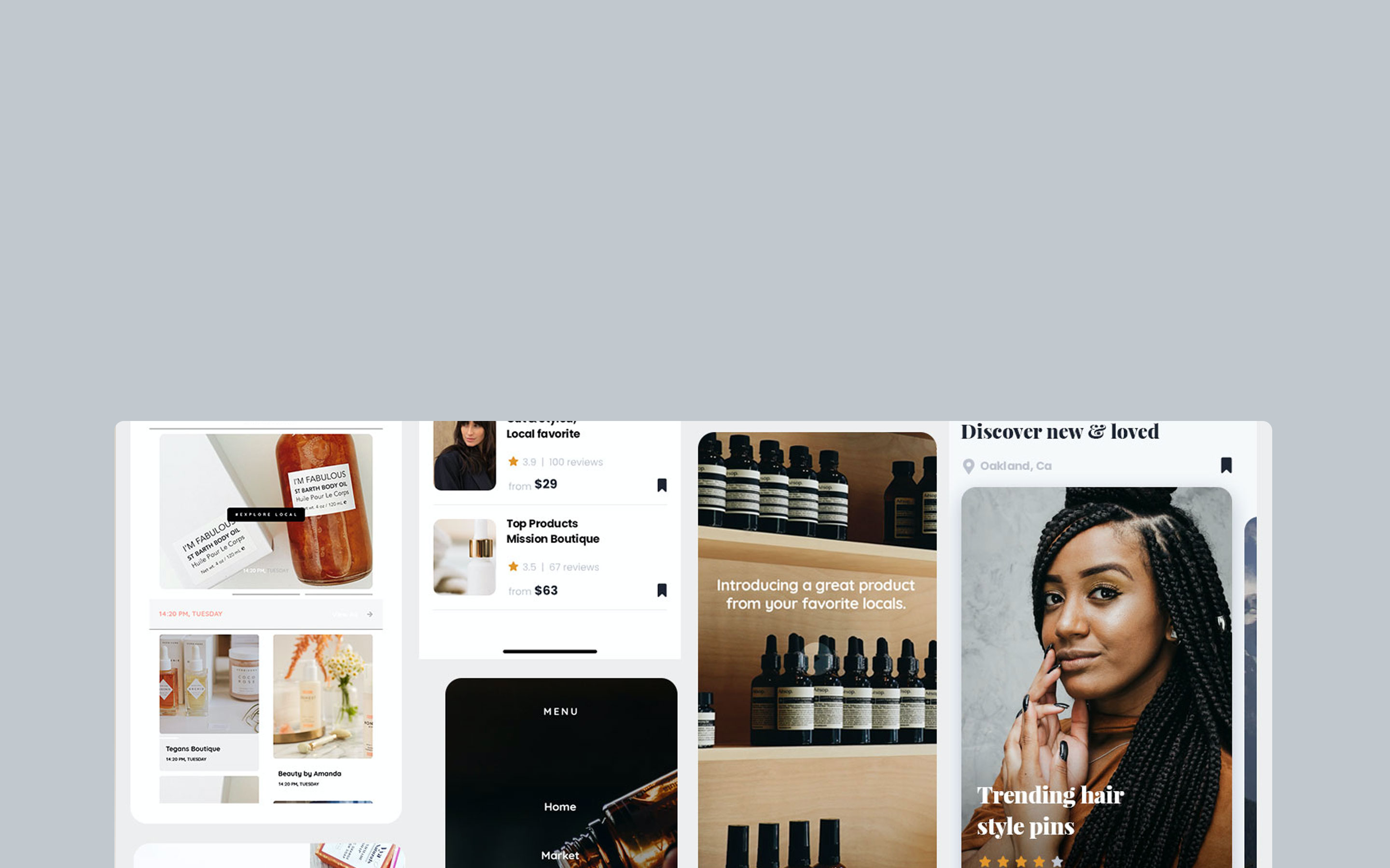
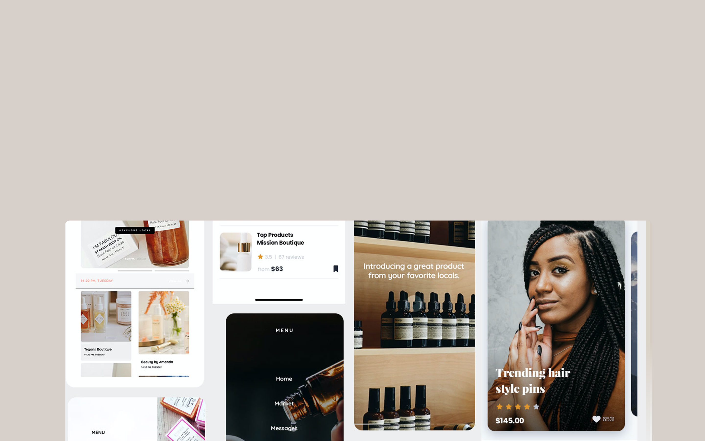
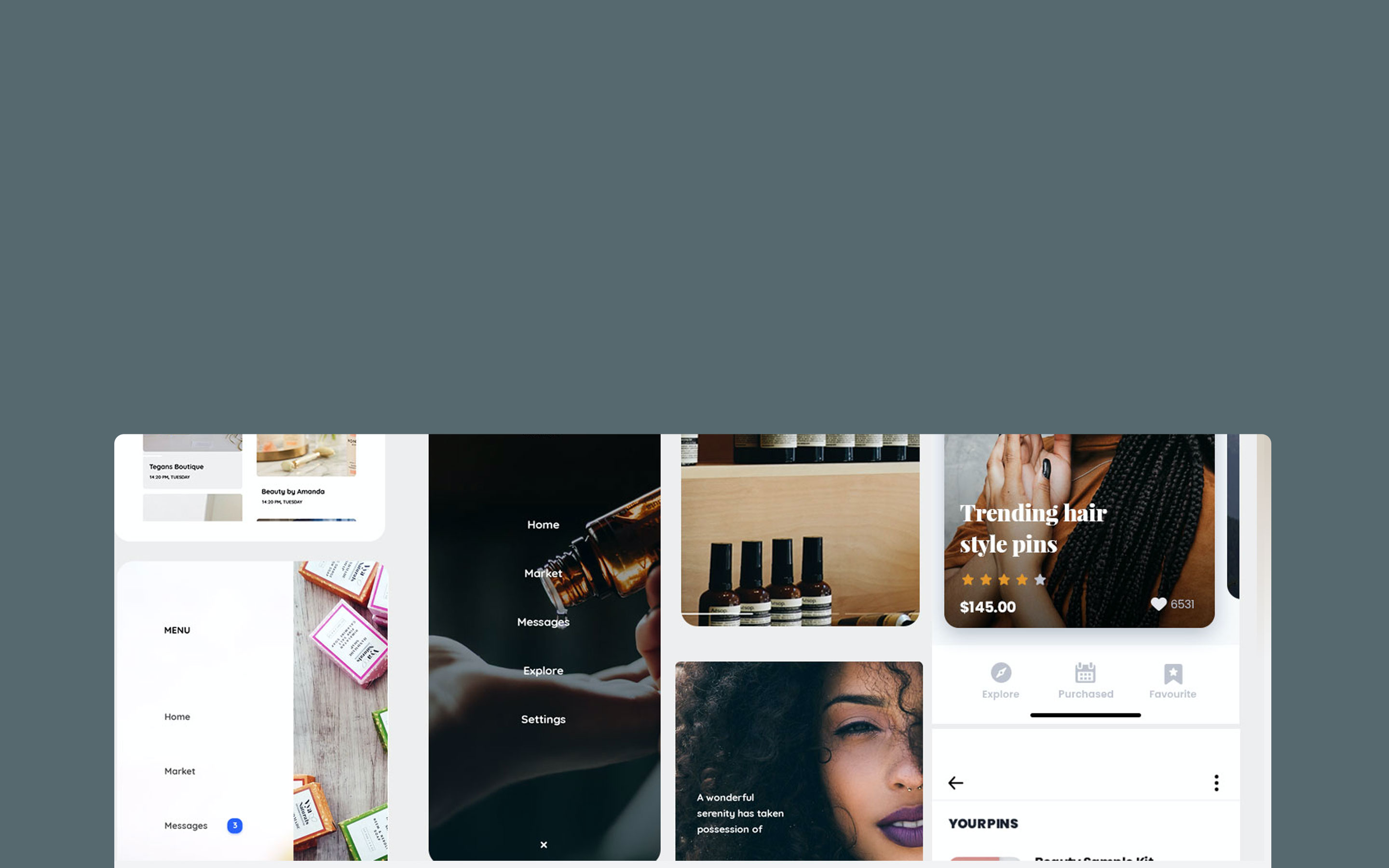
WHAT: a “self-expression engine” where millions of users can “pin” anything that interests them to their own virtual pinboard and share those “pins” with others, from beauty, to hair styles, to services, and more
DISCOVER
Background research
User Interviews
Background research
User Interviews
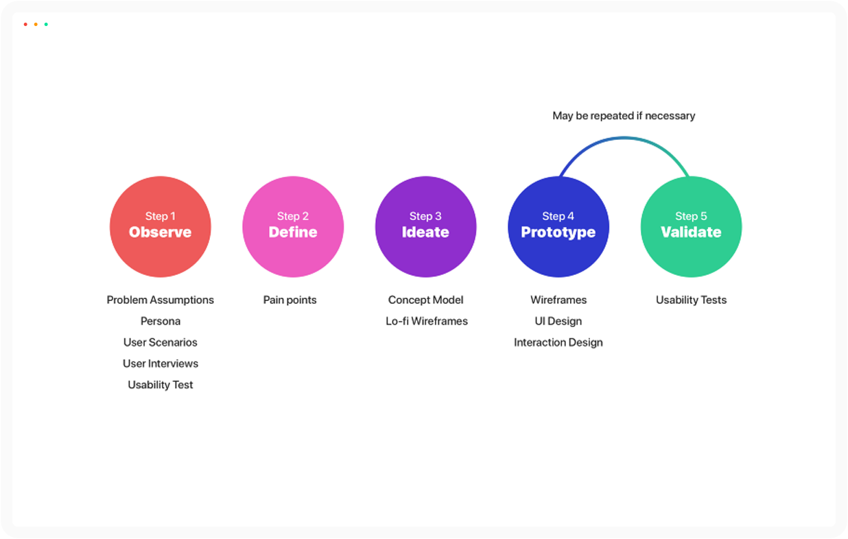
- background research
user interviews
competitive analysis
- how might we's?
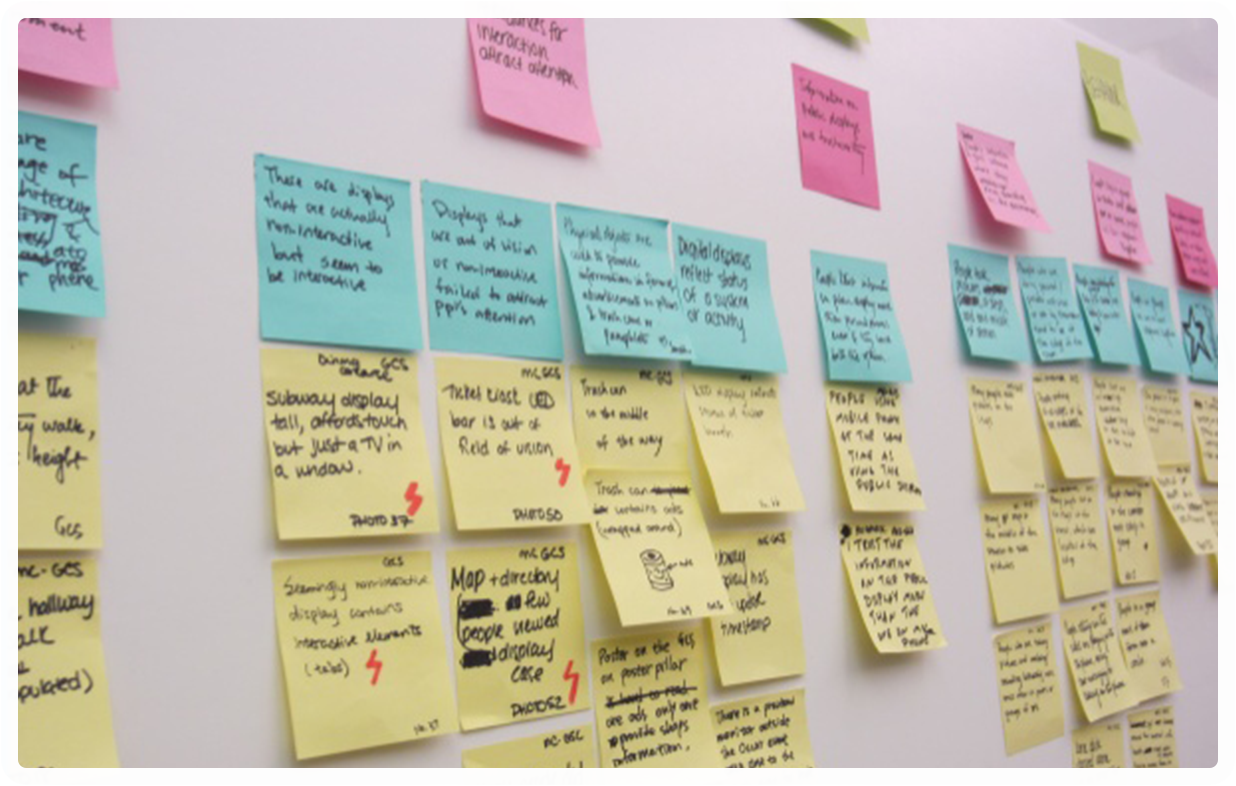
affinity mapping
user personas
customer journey
problem assumptions
persona
user scenarios
usability test
painpoints
concept model
li-fi wireframes
interation design
Discover
Define
Design
Testing
Deliver
Discover
Define
Design
Testing
Deliver
• Pre-launch
Turn those white papers, roadmaps and requirements into use cases, journey maps and wireframes.
• Review & reassessment
Design new features, identify pain points and broken journeys and put the user experience back on track
• Visual makeover
Make the visual styles work cohesively with the products architecture to deliver a positive experience.
•*The first days*
We start with discussions, questions, and gathering requirements. Then we discuss timelines and delivery dates, the tools we’re going to use and the framework for developers hand-off.
• *The production stage*
Production begins with research, applying a range of tools depending on the project requirements. We then analyse the findings and finalise the design objectives. Then we start producing your deliverables.
• *Refinement*
We present the deliverables, followed by an open discussion and Q&A. We tweak anything that needs changing before handing-off to developers.
THE SOLUTION:
*PUTTING THINGS IN CONTEXT*
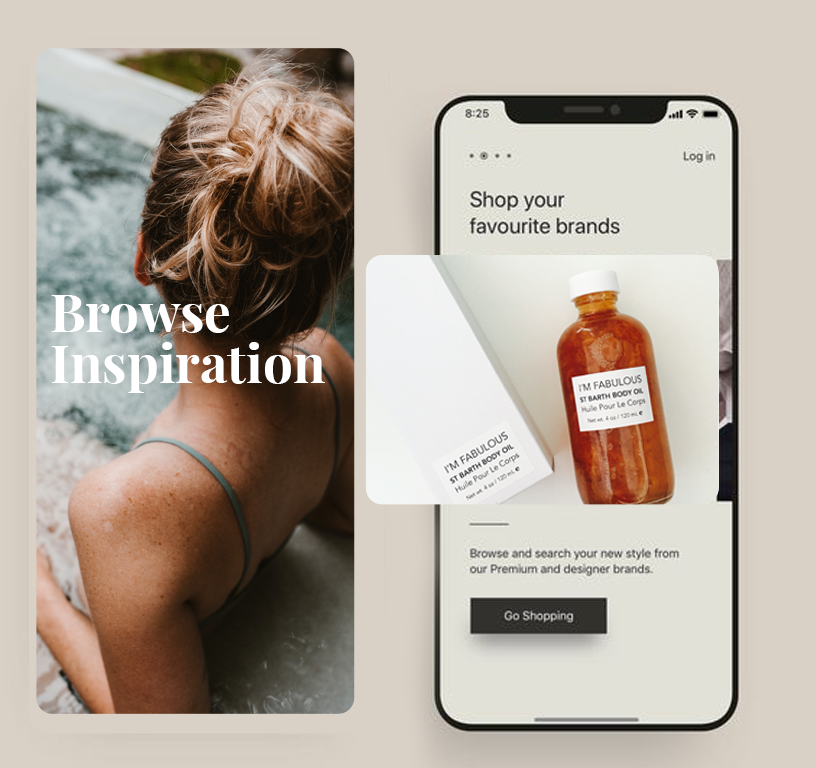
The new onboarding journey incorporates these essential actions in a way that
makes sense to the user
through proper
contextualization.
